Showing posts with label data visualization. Show all posts

Tuesday, April 18, 2023

Looking at historical returns of stocks and bonds with Power BI and Python

You might already have seen below graph taken from a study by JP Morgan Asset Management, but what if you would like to look at historical returns without going  through the hassle of having to collect all the data yourself?


There is an interesting Excel sheet shared by Aswath Damodaran (@AswathDamodaran)  that you can download from Historical Returns on Stocks, Bonds and Bills: 1928-2022 which looks at returns of different asset classes (stocks, bonds, bills, real estate and gold) over a longer time period.

In this post I will share some tips on how you can use this data in Power BI, Python and Jupyter notebooks. 

This Historical Returns on Stocks, Bonds and Bills: 1928-2023 - Excel file  file is updated in the first two weeks of every year and it is being maintained by Aswath Damodaran, who is a professor of Finance at the Stern School of Business at NYU, he is also known as the "Dean of Valuation" due to his experience in this area.

Visualizing S&P 500 and US Treasury bond returns using Power BI

I first converted the Excel from  xls to xlsx format and afterwards it is quite easy to  import the data from an Excel workbook files in Power BI . It is quite easy to visualize the returns of  both stocks and US treasury bonds using a clustered column chart - I also added a minimum line for both stock and bond returns.

Expected risk and expected return should go hand in hand: the higher the expected return, the higher the expected risk. Risk means means that the future actual return may vary from the expected return (and the ultimate risk is loosing all of your assets). The first visual showed a 20-year annualized return between 1999 and 2018 for the S&P 500 of 5.8%.  Average returns hide however the big swings in yearly returns - e.g. in 2008 (the Great Financial Crisis), the S&P 500 had a -36.5% yearly return. Bonds on average have a lower return but also have a lower risk profile. 

The basic rule of thumb is to keep your “safe money” (i.e., money you don’t want to risk in stocks) in high-quality bonds. While this doesn’t give you 100% protection against losses at all times, it does provide you some peace of mind. I really like this quote: "If you can't sleep at night because of your stock market position, then you have gone too far. If this is the case, then sell your positions down to the sleeping level. (Jesse Livermoore)"

As you can see in the visualization below, in most years with a negative return for the S&P 500, the return for bonds is positive - with two notable exceptions 1969 and 2022. A common saying is to have your age in bonds. Using that general rule, a 45-year-old might have 45% of the total portfolio in bonds. If you want to more aggressive, you would have less than your age in bonds. The last decade with interest rates very low (or even negative) this probably wasn't a very profitable asset allocation but 
things might have shifted.
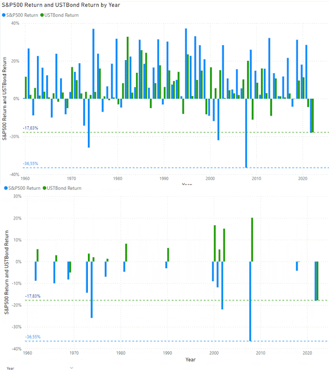


The US Treasury Bond used in the Excel file is the 10-year US treasury bond for which you can download the data from FRED . The yearly return has been calculated by taking the yield and the price change for a par bond with that specific yield.


In the long run (see example below for different rolling windows from a 1-year to a  20 year period)  stocks will outperform bonds but this again works with averages and it ignores the tail risk which might wreak havoc in your portfolio.


Reading data from Excel using Python

Now let's take a look at how you can read and manipulate the data in this Excel sheet using Python. To read an excel file as a DataFrame, I will use the pandas read_excel() method. Internally, Pandas. .read_excel uses a library called xlrd which you also need to install but I used the  openpyxl library as an alternative which also works. So before you can read an excel file in pandas, you will need to install 


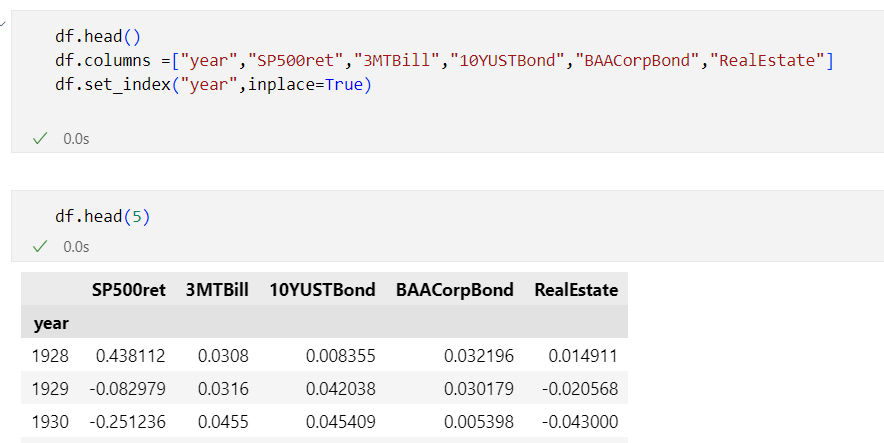
The above code reads only the table with data from the Excel file (which I downloaded in a subdirectory data from the Jupyter notebook) - see  pandas.read_excel in the Pandas referencel documentation for full details:
  • sheet_name: can be an integer (for the index of a worksheet in an Excel file, default to 0, the first sheet) or the name of the worksheet you want to load
  • nrows: number of rows to read
  • skiprows: number of rows to skip
  • usecols: by default all columns will be read but also possible to pass in a list of columns to read into the dataframe like in the example

I just started exploring some data around stock-bond correlations and will be updating the Juypyter notebook on Github - https://github.com/jorisp/tradingnotebooks/blob/master/HistoricalReturns.ipynb

A couple of weeks ago I noticed this interesting tweet on rolling one-year-stock-bond correlations for six regimes from @WifeyAlpha - I think it would make an interesting exercise to see how to rebuild this using Python.


References:

Related posts:

Wednesday, November 16, 2022

Visualize S&P 500 data in Power BI using Azure Synapse Serverless SQL Pool

In Explore and analyze stock ticker data in Azure data lake with Azure Synapse serverless SQL Pool, I showed you can download stock ticker data from Yahoo Finance, stored it in Azure Data Lake and retrieve the data using standard T-SQL in Azure Synapse Studio. In this post, I will show how easy it is to consume the data from Synapse SQL Serverless using Power BI.


For the standard visual with the evolution of the S&P 500 closing price, I connected directly on SP500 external table in the Synapse SQL. You can connect to Synapse SQL Serverless using either the Azure SQL Database or Azure Synapse Analytics SQL connector and you will need to enter the Serverless SQL endpoint which looks something like this <yoursynapse>-ondemand.sql.azuresynapse.net


With the second reported I want to visualize the S&P 500 yearly return and the average return since December 1927. To make it easier, I created a separate view on top of the external table which calculates the yearly returns


As you see from the visual, returns can vary quite a lot both on the negative side as well as on the positive side - for the last 20 years, there was a huge drop in 2008 (-38%) and also this year is not looking great (-22%), but 2013, 2019 and 2021 all had returns above 20%. On average across the S&P 500 returned 7% (not included dividends).


For the last visual in the Power BI report, I wanted to show a histogram with the S&P 500 yearly returns. I based myself on Power BI Histogram example using DAX since  Power BI does not have a standard histogram and I did not want to use a custom visual ( I used Power BI custom visuals from Pragmatic Works in the past)

Equity returns roughly follow a normal distribution or "bell curve", meaning that most values cluster near the central peak and values farther from the average are less common.  Stock returns however have fat tails - meaning that the occurrences on the extremes are far more common than expected in a normal distribution.  The Greate Depression (1931) and the Global Financial Crisis (2008) led to two of the largest stock market losses of the S&P 500. With a loss between -20% and -30% this year, we are in the same category/bin as 1930, 1974 and 2002.


Monday, October 21, 2019

Using Twitter analytics data in Power BI – Part 1

I have been using Twitter for over 10 years but I never paid a lot of attention on engagements or impressions statistics but after listening to the Microsoft flow with Jon Levesque podcast  from @nz365guy I decided to take a look at what are drivers for more impressions or engagements on my Twitter account. So I decided to create some Power BI reports based on Twitter activity exports.


I only used Power BI in proof of concepts up until now so this was a good opportunity my Power BI skills which got a little bit rusty after not using it for more than a year. To get started I first exported my tweet activity report in CSV format from Twitter Analytics  (I did it manually but there is a REST API available as well). Next I combined the different CSV files while loading it into Power BI (I followed these instructions - How to load data from a folder in Power BI). After the usual data cleansing (remove unused columns, rename columns, setting appropriate date types) and data transformation I started extending the data model. Since I also wanted to know whether there is a difference in engagements/impressions based on the day of the week the tweets was sent, I created a custom date dimension. Power BI creates a default date dimension as well but I decided not to use this – see Power BI Date Dimension: Default or Custom? Is it confusing? for more info.

I also wanted to remove the urls/hyperlinks from my tweet text before building up a word cloud with the most common terms. Luckily Power Query supports some interesting transformation, you can temporarily transform a text into a list using Text.Split(text, “”), perform operations on each word and then reassemble it again using Text.Combine(list, “ ”)  (Trick found on Multiple replacements or translations in Power BI and Power Query)


I used a similar trick to found out the number of hashtags used in a specific tweet.


The Power BI report is still a work in progress but if you already want to have a temporary copy - DM me on Twitter

References: